Picking the right color when designing a room is one of the most important aspects of decor. It can completely make or break the feel of the room. It’s easy to make mistakes when choosing colors, so don’t get too down. Everyone who has designed a room has made some questionable choices. We’re here to help you avoid any more poor color decisions.
The 10/30/60 Color Rule
The first rule that everyone should know when designing a room is the 10/30/60 color rule. This rule establishes that 60% of the room should be your base color. It’s best to choose a neutral shade because it will be the most used color. Choosing a bright overwhelming color will 9 out of 10 times not look good. Not only will it overpower everything else in the room, it could also increase stress levels. The next part of the rule is that 30% of the room should be your secondary color. This color can be a little more fun since it’s not a huge majority of the room. Finally, the 10% is your accent color. This will always be your boldest shade because it’s only going to be 10% of the color in your room.
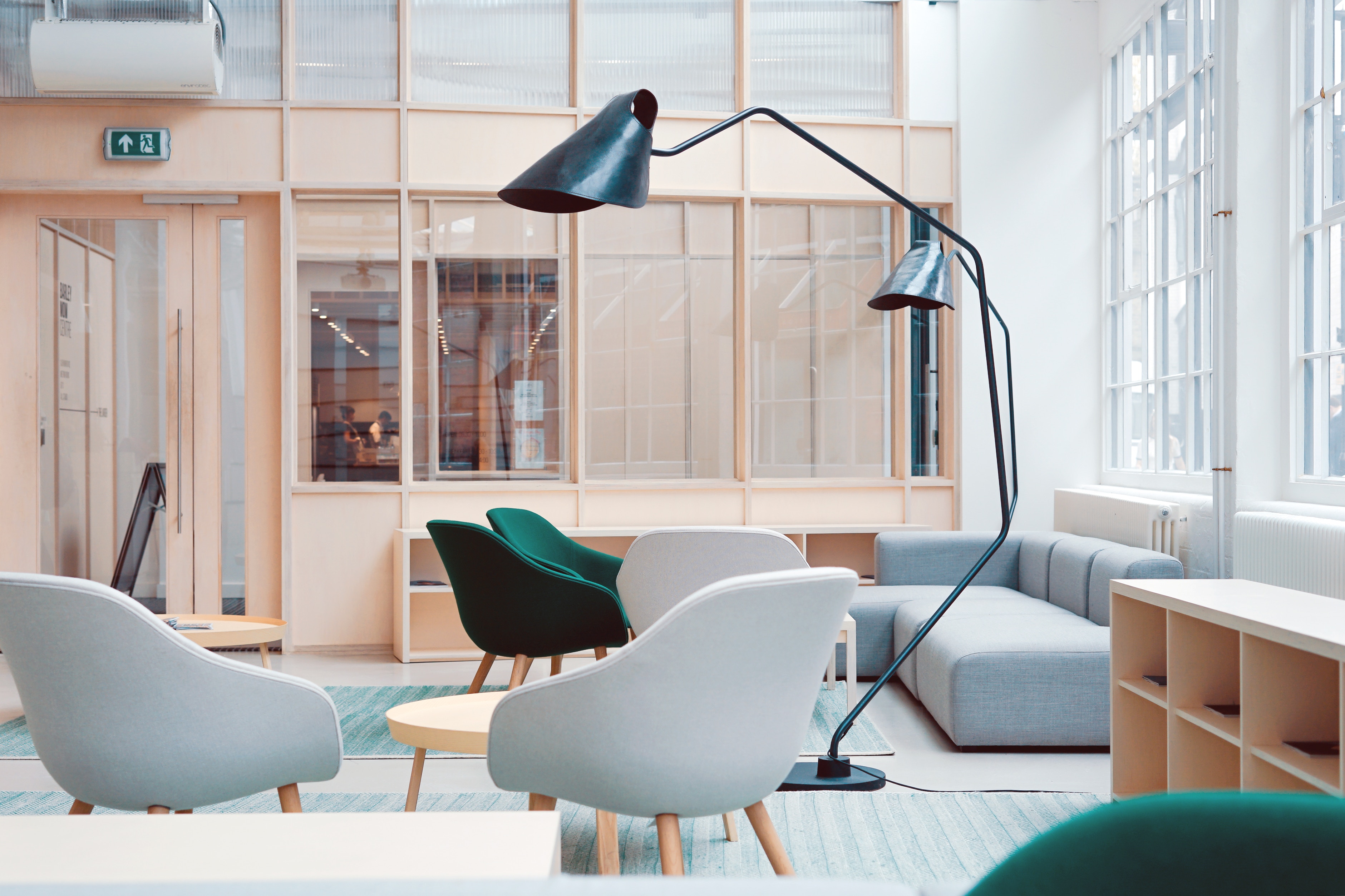
In this image the 10/30/60 rule is super obvious. The white walls are a nice neutral and the light wood provides nice texture in the room. The gray couch and chairs act as a slightly more interesting secondary color and finally, the green chairs are the 10%. They’re the final piece of the puzzle that provide some pop/excitement to the room.

This is another great example we wanted to share. Everything works together well and the red chair and cushions are great statement pieces.
Lighting and Color
Another common mistake is not checking to see how light will affect your choice of paint color. A color that you love in the store might not look as good under different types of lighting. We recommend painting your options on the desired wall in areas that are hit by natural light, artificial light, and even darker parts of the wall. This will save you the headache of having to completely redo a paint job because of lighting you didn’t anticipate. Playing around with warm and cool colors is a good idea as well. Check out our post about warm and cool color design tips here.
Matching Colors Too Much
Matching too much is almost as bad as not having any sort of color scheme. If everything in your room looks the same it becomes very boring. There is nothing that draws your eye in or makes you interested in the room. The best way to avoid this is to use similar colors, but different shades and textures. Add in some accents or statement pieces and you’re good to go!
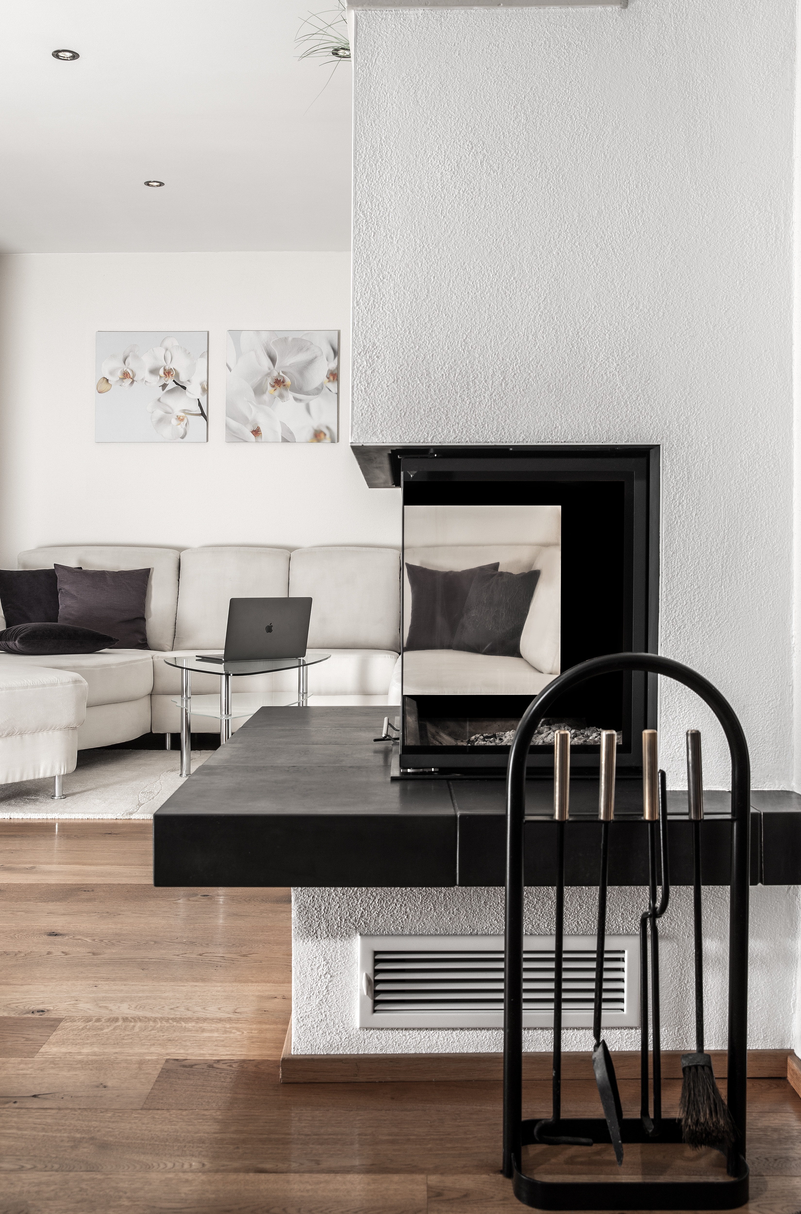
This example has a lot of similar colors, but the textures of the stone, wall, and fireplace break up the monochromatic colors.
Trendy Colors
Trendy colors are tough to work into your design when painting a room. By nature, trendy colors are just that, trends. And as we know, trends come and go. Choosing to paint a room or even a wall a color that’s “trendy” right now may not be the best idea. It won’t age well and then you’ll end up repainting once that color goes from trendy to…something that’s not cool anymore. There are plenty of ways to work trendy colors into your design without painting an entire room or wall. Picking blankets or throw pillows that are your desired color is a great way to go. You can choose different textures and when you get bored of them, it’s easy to swap them out for something new!
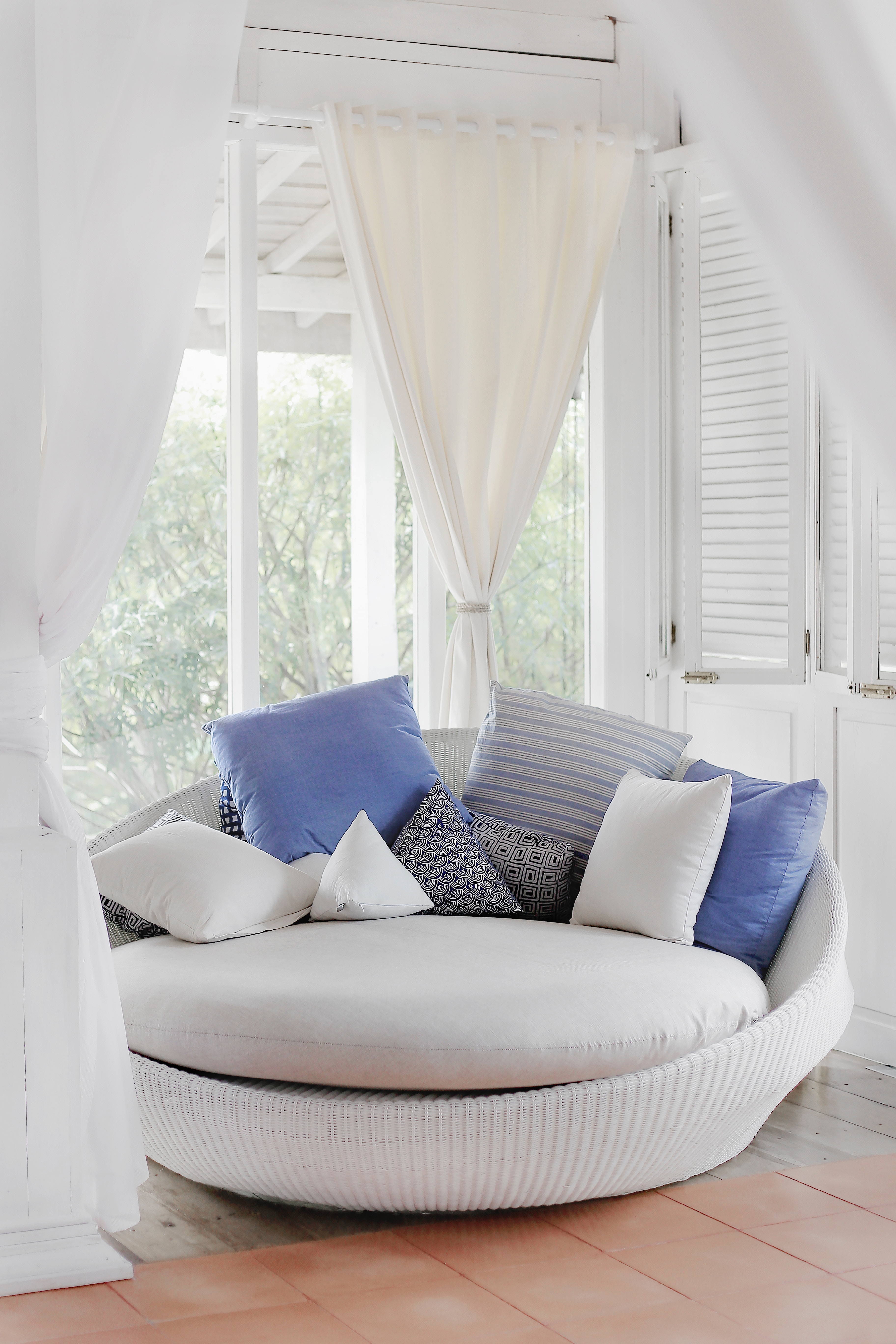
Lavender is the 2018 color of spring and summer. Instead of going crazy and painting your living room lavender, opt for some nice pillows that act as accent pieces.
Hopefully these color tips will help you design the perfect room. Of course, these are just guidelines, not rules set in stone. After this quick read you should be well on your way to designing the room of your dreams!
Leave a Reply